The Beginning
_
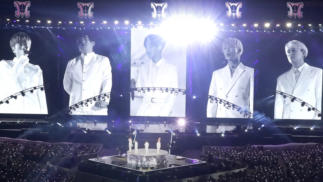
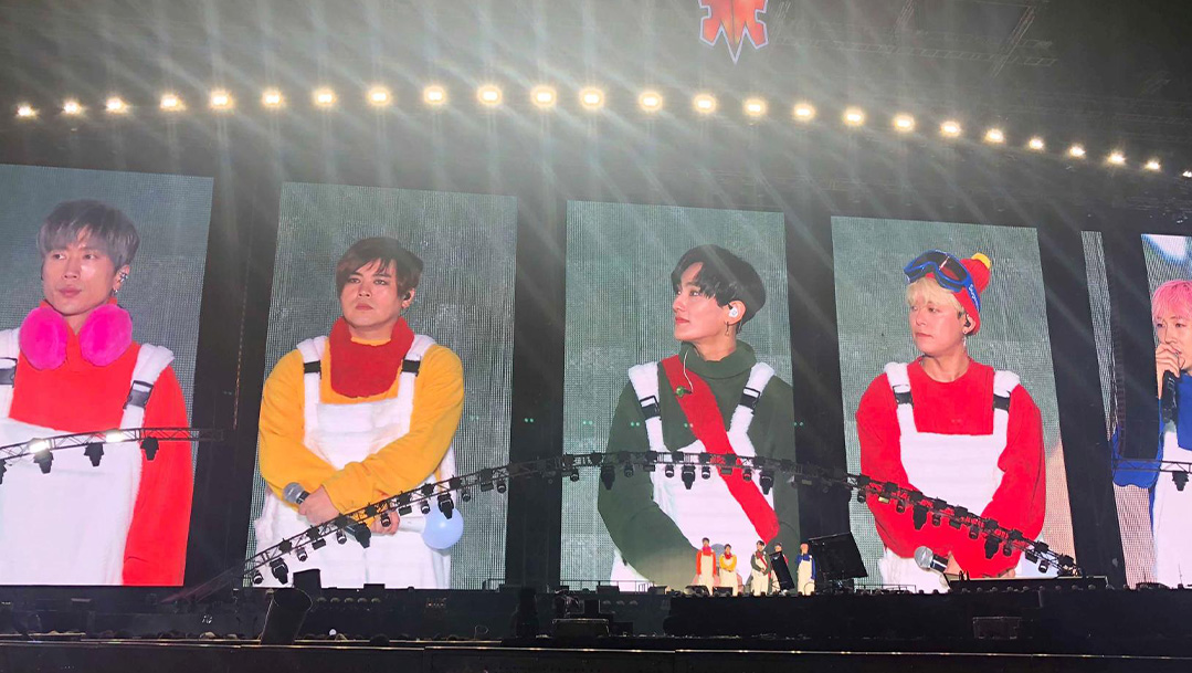
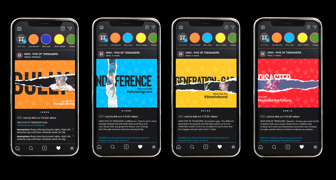
High-five of Teenagers, a pioneering K-pop boy band, emerged onto the scene between 1996 and 2001 before regrouping in February 2018. Their ascent was marked by consistent chart-topping performances and a fervent fanbase, particularly among young girls. Their lyrics often delved into poignant social themes such as violence, bullying, and generational divides. Despite disbanding in 2001 due to contractual disputes, the group reunited after 17 years, staging their triumphant return with a sold-out concert in Seoul, South Korea, in 2018.
The Process
_
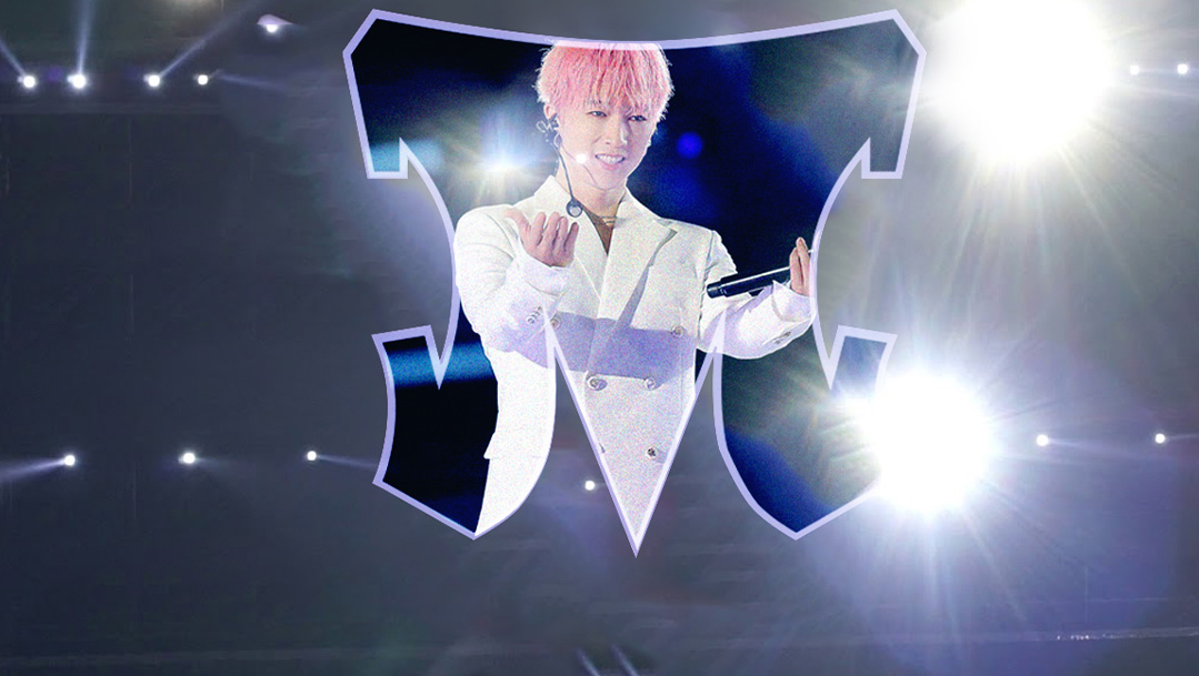
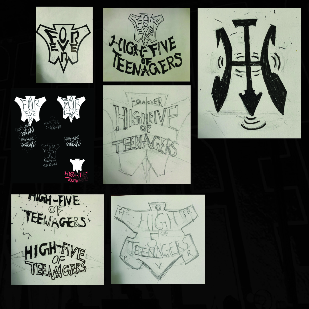
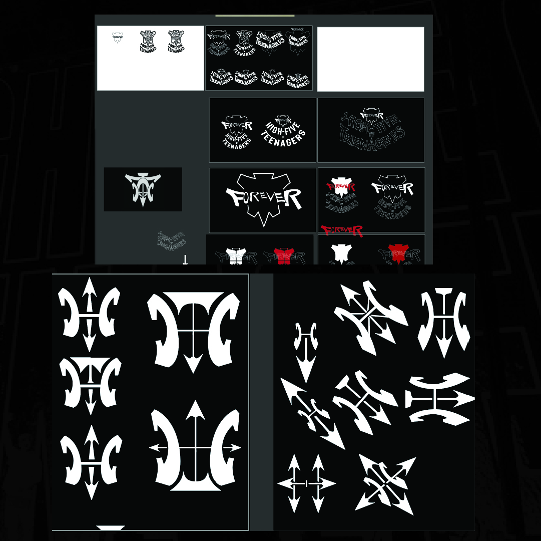
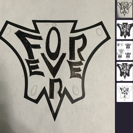
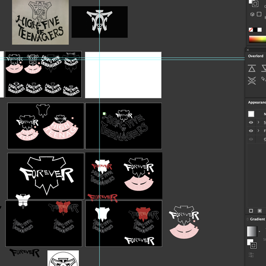
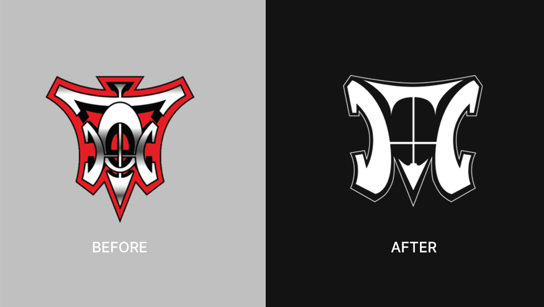
Logo Revamp: Making a comeback after 17 years, the band aimed to resurrect their original logo. However, due to contractual obligations with SM Town, their former album contractor, they were unable to utilize the old logo for stage performances and other content. Consequently, my solution involved crafting a fresh, modern rendition of the logo to meet their needs.
After numerous rounds of sketching, a sudden inspiration struck me: utilizing an arrow as a symbol of rebellion, directing downwards towards pertinent issues. Integrating this concept, I merged the original element of the letter 'H' with the arrow, creating an invisible 'O' at the center. White was chosen as the primary color, resonating with the attire of fans who often don white raincoats and hold white balloons during the band's performances.
Inspirations
_
Looked at logos with letter combinations throughout the process from google and Instagram posts.
The Result
_
The Result
_
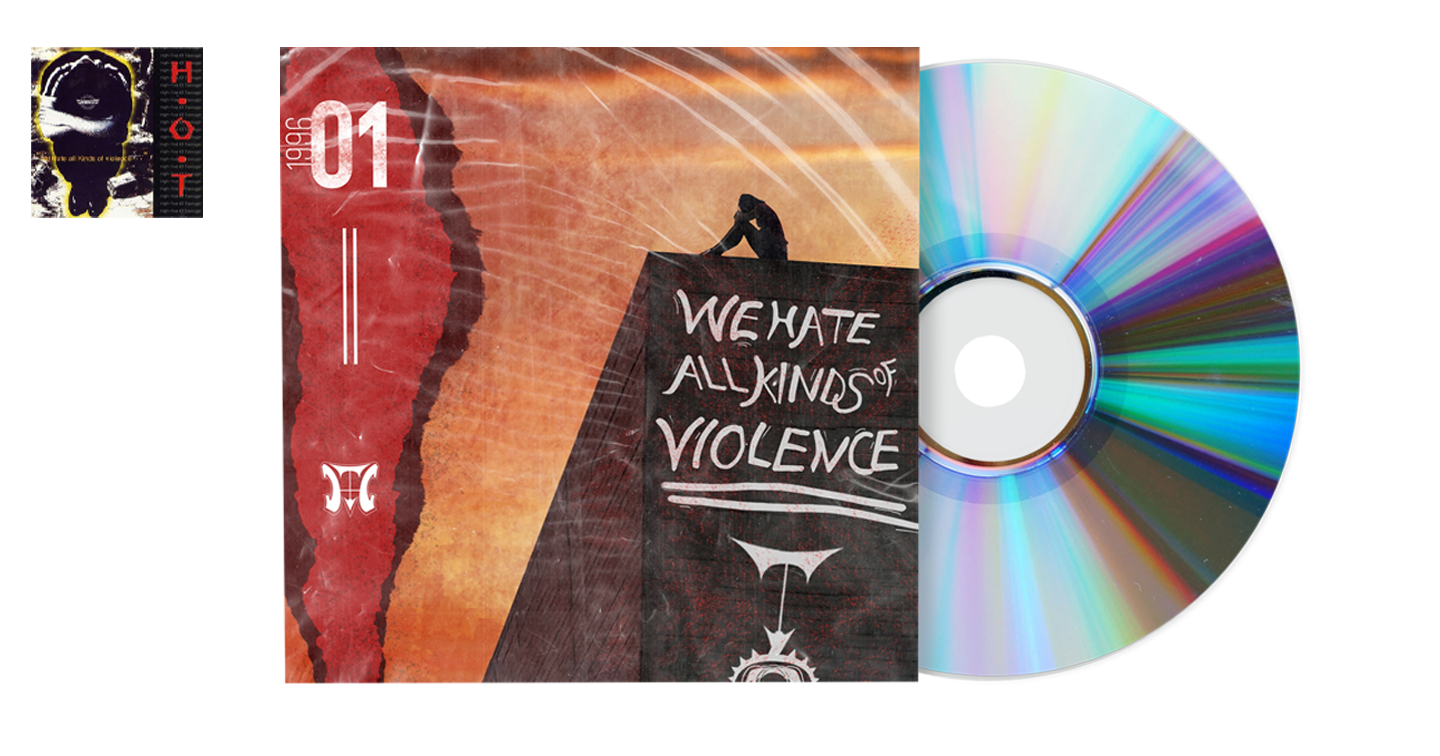
Album Drafts
_
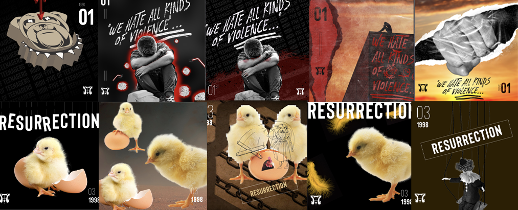
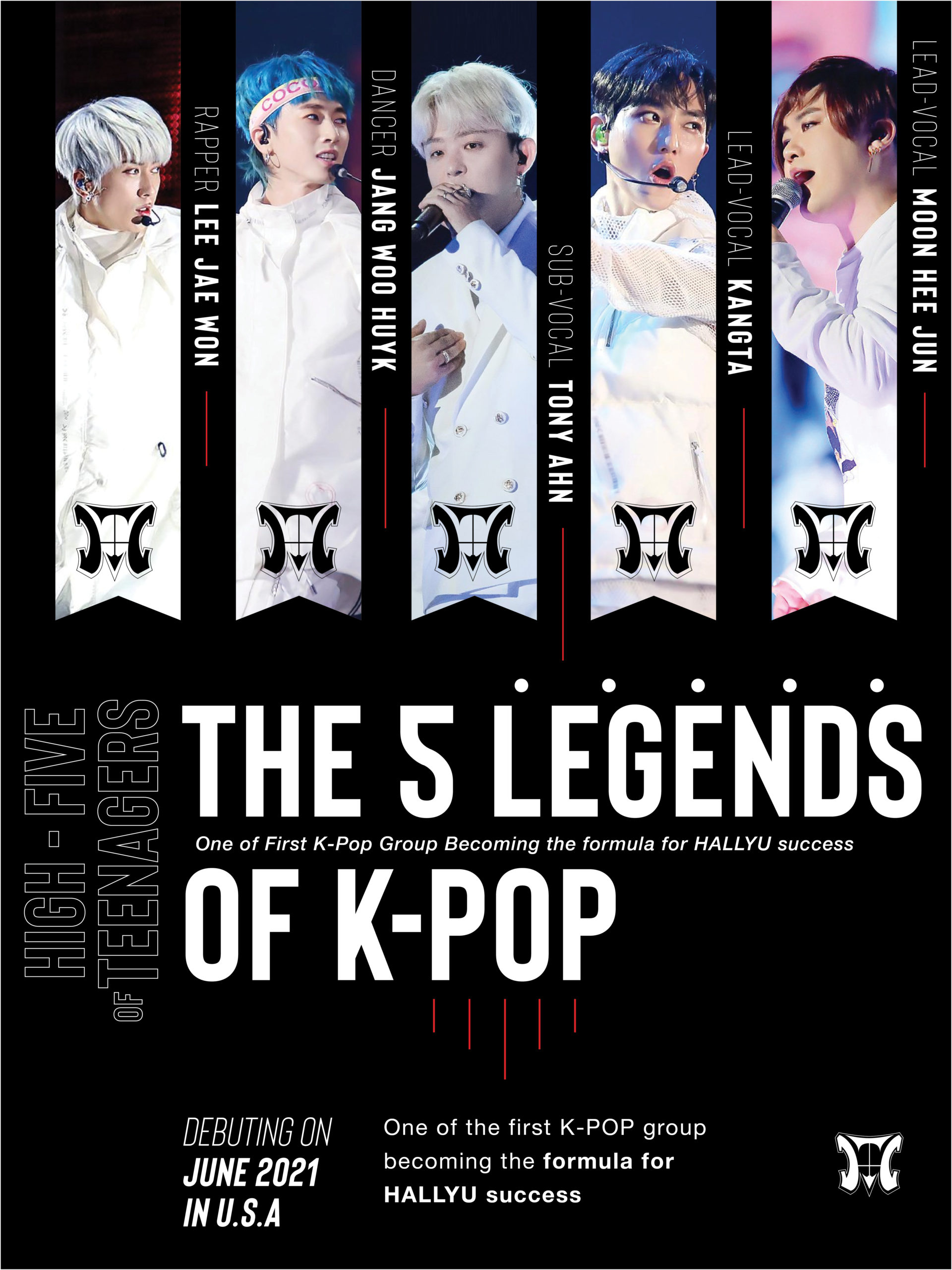
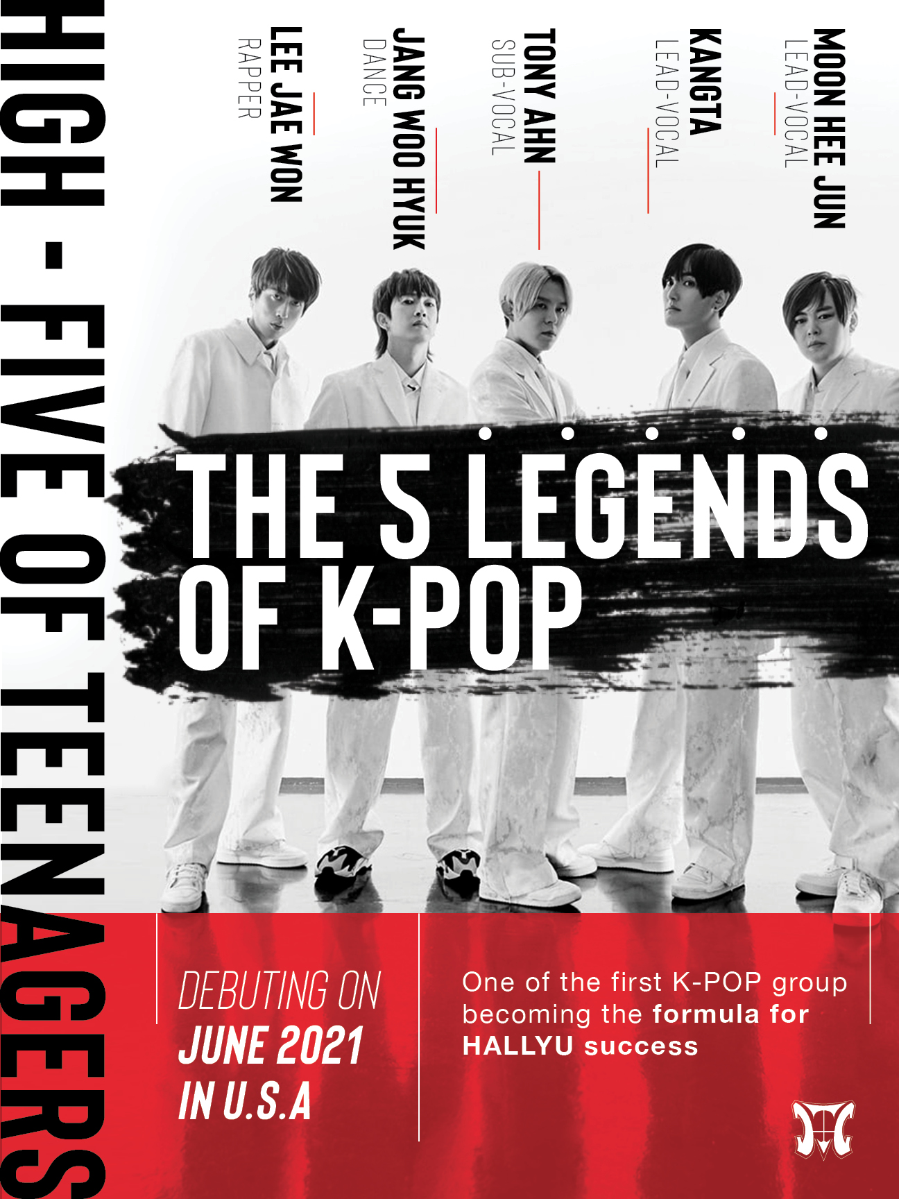
Some rough variations of the Album cover.
Album Drafts
_
Some rough variations of the Album cover.
